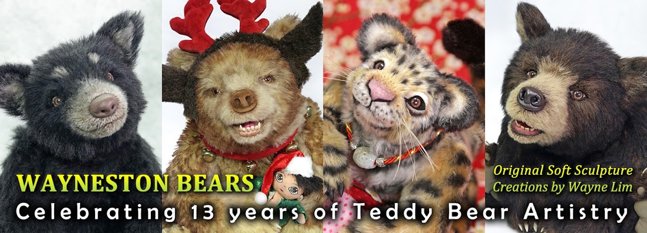
Hence, I have relooked into it and done some minor changes to my logo design few weeks ago.
My Wayneston Bears logo was created using Adobe Illustrator file, each curves and shapes were individually controlled by points, hence it takes a long time to do adjustments but I am able to manipulate to the angles that I want.
Are you able to Spot the Difference??? Haha... If you do, you are really good...
In total there are 5 changes, I will leave the answers on my comments.
My new squirrel creation is ready to show you, please come again on Sunday to see her. Have a great day! =)
Hugs, Wayne


Here are the answers!
ReplyDelete1) Eye Whites changed to yellow
2) Eye Whites are leveled to the same height
3) Hair and ears on the left thickness have slightly increased
4) Wayneston Bears font text are enlarged
5) Card Size has lengthen to more information at the back of the back.
Hope you enjoy this game! =)
I got two of them and had a hunch about a third on, but the other two completely had me stumped!!
ReplyDeleteThanks for the fun!!
Warmly,
Cheryl
I think its not a big changes in this logo. I found some minor changes. But this logo really look superb.
ReplyDeleteCustom Logo Design